Potlatch 2/merging functionality
Potlatch 2 has functionality (but not accessible by default, see #Documentation and developer's info) for merging vector background data with OSM data. Initially the only functionality was to "bring through" the entire feature, but as part of the England Cycling Data project, more features were added by Andy Allan (aka Gravitystorm).
This process of inspection and merging (i.e. conflation) of third-party data sources is reasonably new, and is being shown as a viable alternative to imports. However, because it's still so new, there's a lot of improvements that can be made. Below are some discussions on this merging functionality.
Example - feedback wanted
An example of using the merging functionality is available via the England Cycling Data project project. It includes an instance of Potlatch 2 with all the vector background layers pre-loaded.
Documentation
In order to trigger the merging panels, you need to do two things. First, add a vector background layer to Potlatch 2 using the SnapshotLoader, for example, include this in vectors.xml:
 <set loaded="true">
   <name>Wolverhampton - 20120127</name>
   <loader>SnapshotLoader</loader>
   <policyfile>https://gravitystorm.dev.openstreetmap.org/cnxc-snapshot/crossdomain.xml</policyfile>
   <url>https://gravitystorm.dev.openstreetmap.org/cnxc-snapshot/projects/46/api/</url>
 </set>
If you're not deploying your own version of Potlatch 2, then someone else will have set it up for you.
Then, when you have the background data loaded up, you can
- Click on the background feature to inspect its tags
- With a background feature selected, ctrl-click (or cmd-click) an OSM feature to see a side-by-side comparison of the tags.
You can copy tags from the background feature to the OSM feature as appropriate, and you can even mark a feature as "complete" aka reviewed.
Feedback/ideas
If you have any feedback on the Potlatch 2 merging functionality, then you can add it below.
Wireframe mode needs to be set by default
Wireframe mode needs to be set by default – it makes it a *lot* easier.
- That's easy enought to fix - of course, it's up to each deployment of P2 as to whether to enforce this. --Gravitystorm 14:51, 8 March 2012 (UTC)
Hiding building outlines or other lines
Building outlines are not relevant for this particular dataset, and have the effect of cluttering up the wireframe view to some extent when the Bing imagery is good.
I wonder whether, when the dataset is known to be dealing only with a specific type of data, a configuration option could be set associated with the layer that disables certain data, e.g. building/wood, or tickbox ‘hide...[the same list]’.
- This is unlikely to work - all editing of OSM data needs to show all the ways, nodes etc that are already in the database. Otherwise, you'll find people duplicating stuff due to different tagging. The general case of "hiding" some data would need to be solved before it can be used in this tool. --Gravitystorm 14:51, 8 March 2012 (UTC)
Background data already has one or more attributes that already match
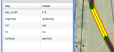
Clicking on a wide line shows all the data in the external dataset. However, some of the attributes may already match the OSM data.
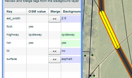
In the example below, in the first screen, the external data has highway=cycleway. This already exists in the OSM data. Therefore it would be useful if the first screen had this grayed out a little, with a tooltip like “This attribute value matches OSM already”.
This would make it clearer what data is ‘extra’ but provide the context that helps the OSM volunteer be sure that the data is more likely to be correctly matched.
(The merging screen already correctly makes the matching clear, with the lack of a button and use of a green rather than blue background.)
- This is a bit of a contrived example. The background data (in the England Cycling Data project) happens to have been deliberated snapped to OSM data, which is unlikely to be the general case for using the merging tool. And in any case, even in this example, the 1:1 match between the OSM data and the background data is guaranteed only for the first couple of hours after the data was created - as OSM changes, there won't be such good correlation. That's why you need to deliberately pick the background feature, then decide which of the OSM features is the relevant one, before seeing any comparison. --Gravitystorm 14:51, 8 March 2012 (UTC)
Blue hover-on-OSM line not clear when a background layer present
Wireframe OSM lines, at any point on the map, have three states: (1) Black by default (no action/status); (2) Blue on hover (ready to select); (3) Red when selected.
For discoverability that the user can select two different layers, there are quite correctly two hover styles. For the external data layer, hover turns it yellow. For the OSM layer, it turns blue.
When the OSM data has an external data line around it, the change from black to blue is hard to discern. The effect is that it is not very clear to the user that there are two different clickable regions. They may miss the fact that the black is clickable.
It would probably not be desirable to have a different colour than dark blue for the OSM hover, as that would make it inconsistent. So a possible solution is for the dark brown fill of the thick line to be a little lighter, so that the change to blue on OSM-hover is more obvious.
- I can work on the stylesheets used - wireframe.css and snapshot.css - and see what improvements can be made. Obviously each deployment of the merging tool is free to use whichever stylesheets they want, and customise them as they see fit. --Gravitystorm 14:51, 8 March 2012 (UTC)
Control-click can be difficult and the background data could be more discoverable
The process for merging is: (1) Click on thick (external data) layer; (2) Control-click very carefully on the thin (OSM data) layer. This switches the left panel to Advanced mode and shows the external data layer.
The differentiation between the external data and OSM data layers is good. The former has a thick line, which is lit up in yellow. The latter, when selected, is shown in an unchanged thin thickness and in red, exactly the same as if there was no background layer. Once the user has realised (see issue 4 above) that the two are independently clickable, the user is very clear that there is a difference between the two.
However, by contrast the process of getting to the merging UI is not fully intuitive. Although the user might see the small text “You have selected a Background Feature.” which hints about some special status, there is no visual indication that Control-click is the special shortcut to be used, and it has to be selected very carefully because there are two lines in the region (the thick, now yellow, one, and the OSM one, requiring considerable manual dexterity.
It is noted that Control-Click only seems to have the effect of switching the user to the merging tool and no other action.
Improving the discoverability of this background layer merging tool is a high-priority requirement.
A solution would be a clear, coloured button appearing in a new line under “You have selected a Background Feature.” that says: “Show merging panel” or similar. This would have exactly the same effect as using Control-Click (which should stay as an action).
Equally, when the OSM layer is selected (only), and thus shown in red, there is no indication of the merging tool. A similar button is needed. The result will be that, when either line is selected, the user is clear that there is merging activity they can undertake.
- The suggestion of a button marked "show merging panel" is flawed, since it's impossible to determine which other feature to select automatically. Again, it's an artefact of the DfT dataset that they are not only well aligned, but also clipped to the same extent. Ctrl+click is used elsewhere in Potlatch 2 to select multiple features. I've added information to the background panel to indicate how to select the second feature and enable the merge panel. --Gravitystorm 14:51, 8 March 2012 (UTC)
Switching to advanced (tag) mode is not consistent with external data layer
If the user is doing normal data editing in visual mode (not Advanced mode), then clicks on a thick line (external data layer), the left panel correctly switches to Advanced (tag) mode.
However, if the user then clicks on the thin black OSM data layer line in the same place, they are then switched back to visual mode. The user then has to realise that they have to switch to Advanced mode.
Given that the user has just selected an external line and then selected the thin line in the same place, this is a clear intention of wanting to compare the two datasets. It therefore makes much more sense for this flow of Thick-line-click > Thin-line-click to honour the user’s intention and automatically show the Advanced (tag) interface instead.
It is very likely that if the user is using the editing tool, they have the intention of reviewing attributes. Therefore this switch should have the effect of activating the global toggle between the two modes (i.e. that the code effects a global memory of this when a user presses Advanced to enter tag mode on any OSM line and this state persists when checking other lines.
If issue 5 (adding a ‘Show merging panel’ button is fixed, that will also mean that they are then invited very directly to begin merging.
- I disagree. Simply clicking on a background feature isn't an indication that they want their Simple/Advanced mode preference overridden for the rest of their work. --Gravitystorm 14:51, 8 March 2012 (UTC)
Lack of >> button in merging panel
The only way to undo a mistaken ‘merge in attribute’ action, i.e. << is to use the top-level undo UI. However, the error might not be spotted until later in working through the attributes of a single line.
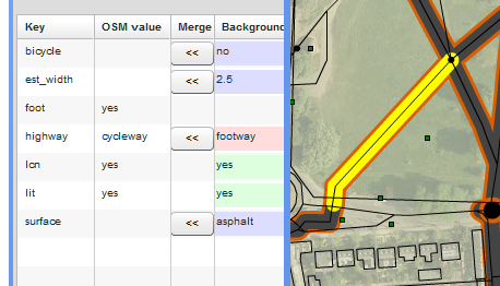
For instance, if there are a lot of attributes listed, the user’s mental model is more likely to be tested. In the screenshot below, there are 6 attributes in the external data layer that could be merged in. There are only four buttons, and the OSM value is present when the merge button is present or the background does not match. There are also four colour states for the background.
All these UI elements are entirely correct, and should not be changed, but the amount of detail means that mistakes could be made.
Therefore a >> button should be present, but this should be grayed out a little, as otherwise it obscures the main << buttons. In other words, >> is only a secondary action and is a fallback for mistakes, NOT a generally-intended standard action.
- It's possible that, when the merge button is pressed, we could store the original tag and display a "revert" button. I'm not sure how useful this would be though, and it would only be possible to keep the reverted tag until the features are deselected. I think it's better to rely on the normal undo system. --Gravitystorm 14:51, 8 March 2012 (UTC)
Feedback: Lack of ‘merge all attributes’ button is correct
By way of general feedback, the lack of a ‘merge all attributes’ button is correct. This would encourage casual reviewing. The merge buttons (e.g. four in the above screenshot) are intuitive and quick to use.
‘There is external data available for you to review in this area’ in main P2 editor
It is not clear yet whether this data will be available yet in the main P2 editor or whether a specific URL will have to be gone to.
It would be very helpful if this data were available in the main OSM P2 editor (and available to local installations, such as that on CycleStreets, by way of a published configuration or standard distribution).
If generally available, it would be very helpful if a UI indication to users could be given ‘There is external cycling data in this area available for you to review’. Clicking on such an indication would switch to wireframe mode and give a modal box quickly summarising the data, linking to a wiki page, and making clear that the very local area shown on the map might not show data even though it is available in the wider bounding box (i.e. UK-wide).
However, if the system can actually quickly check the presence of data that would be even better.
- The data (in the DfT project) is certainly available for any installation of Potlatch 2 - if you visit the snapshot server, it shows the configuration snippets available for each project hosted. I'm not sure whether it'll make it into the www.osm.org version or not. --Gravitystorm 14:51, 8 March 2012 (UTC)
Statistics
Statistics of per-area merging somewhere would be useful, as per other OSM projects like the ITOworld OS Open Data comparison tool.
- Now implemented, see e.g. https://gravitystorm.dev.openstreetmap.org/cnxc-snapshot/projects/1 --Gravitystorm 14:51, 8 March 2012 (UTC)
“All the data copied to the main layer?” is misleading
The label “All the data copied to the main layer?” asks the user to confirm whether “ALL” data has been copied to the main layer.
In practice, we don’t want to encourage this as some attributes will be wrong. We actually want to encourage the user to *review* all the data and merge where correct.
So a better label could be something like “All data reviewed (copied/rejected) to the main layer? :” ending with a colon so it is clear this label is relevant to the button which follows it.
- Text is changes, now says "If all the information from this feature is accounted for in the main layer, you can mark this feature as 'complete'. This lets other contributors see what still needs reconciling." --Gravitystorm 14:51, 8 March 2012 (UTC)
‘Complete’ button’s action ambiguous
Non-familiar users may misunderstand the ‘Complete’ button as saving the changes the user has made, when in fact its role is purely that of a status marker to say that other people don’t need to bother reviewing the line’s data.
Clicking the marker very nicely changes the thick line from orange-edged to light-blue-edged. This is excellent. It makes an overview of completeness within a screen very clear.
Remove “Click 'complete'!” as this is extraneous text.
Because the term “Complete” could mean “OK” the button needs a different label. So change it to “Mark as fully reviewed”. This text avoids any ambiguity and makes clear this is changing a status, not accepting transfer of the data.
- Implemented as "Mark feature as Complete" etc --Gravitystorm 14:51, 8 March 2012 (UTC)
Applying data to a nearby line instead of the highlighted one
The CNX data has a very good level of matching, thanks to the excellent GIS work Ralph has done. However, it is clear that there many cases are not matched correctly (but the data attributes are correct).
Other datasets may have worse levels of geographical matching.
It would be useful to consider whether there is some way that a user can effectively ‘drag’ the thick line to another line. All other activity would be the same.
However, this drag change would have to be persistent across user sessions and across users.
- No way, José! The point of the ctrl-clicking is to let the mapper decide which features are corresponding. Moving read-only background features around is, from a spatial point of view, exactly *not* what you want to do! --Gravitystorm 14:51, 8 March 2012 (UTC)
Nodes in the external data ?
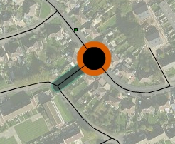
Sometimes after a way merge has been completed, I am left with a mysterious orange node. I haven't found a way to view or merge nodes from the external data. What am I missing? --Monxton (talk) 12:19, 11 September 2013 (UTC)
See also
External links
- Merging tool for external data for OpenStreetMap - initial announcement by CycleStreets
- Merging tool – new cycling data - additional details from CycleStreets


