Template talk:Wfmessage
Colors from osm.org
Instead of the cyan and yellow (which I can't find in use) I tried an alternative with the green: See [1] --Chris2map (talk) 22:09, 24 April 2022 (UTC)
- Thanks for the review! I like that green more and I also associate this more with OSM! When testing the colors, I was afraid that it would be confused with the infoboxes or Template:Place. Both, Template:Software and Template:Proposal Page use the background color to indicate a status, so I guess similar colors can not be avoided. It might be counterintuitive to see Template:Import bot warning with a green background. I really like the different thicknesses of the border lines. --Tigerfell
 (Let's talk) 10:21, 25 April 2022 (UTC)
- I put some Infoboxes to the examples at [2]. It's not bad, IMO. The old boxes like {{Layer}} have never fitted anyway and would benefit from a refresher. --Chris2map (talk) 19:52, 25 April 2022 (UTC)
- Okay, the coloring does not seem to be a problem to me. I suggest to finalise this template first, then we can refresh or re-style the other ones. --Tigerfell (Let's talk) 10:55, 26 April 2022 (UTC)
- Okay, the coloring does not seem to be a problem to me. I suggest to finalise this template first, then we can refresh or re-style the other ones. --Tigerfell
- I put some Infoboxes to the examples at [2]. It's not bad, IMO. The old boxes like {{Layer}} have never fitted anyway and would benefit from a refresher. --Chris2map (talk) 19:52, 25 April 2022 (UTC)
Types
The "type" delete I would either name in accordance to Ambox: danger or - what I'd prefer - alert. --Chris2map (talk) 15:45, 29 April 2022 (UTC)
- I hoped to get rid of all those red boxes on top of pages and include the information into the text or remove the problematic sections. I recognised a need to a red warning message in case of deletion requests. Other messages could use any of the four other types. Do you have an example where you need a red message box? --Tigerfell (Let's talk) 17:13, 1 May 2022 (UTC)
- Ah, I understand. The following infoboxes are using red color:
- {{Deprecated}} → I'm not sure if it must be red. Maybe it would be enough to show
 .
. - {{Deprecated feature}} → Same as before.
- {{Translation not complete}} → Definitely doesn't have to be red!
- So red boxes only for deletes and in case of errors? --Chris2map (talk) 19:38, 1 May 2022 (UTC)
- Yes, exactly. I intended
type=advicefor the first two ones andtype=contentfor the third. --Tigerfell (Let's talk) 10:30, 2 May 2022 (UTC)
- Yes, exactly. I intended
- Ah, I understand. The following infoboxes are using red color:
Spacing around the box
I think we need the 2px distance around the border of the boxes, similar to Ambox. Otherwise it is too close between the boxes and other boxes, or the language bar, or TOC.
See e.g. Potential Datasources, Train routing, Namefinder search doc, MapServer.
I would simply set/test margin:2px. --Chris2map (talk) 19:38, 1 May 2022 (UTC)
- How about 2 pixel above and below only i. e.
margin:2px 0;. Then, it would still span over the whole width of the page as a notification on osm.org and the language bar. --Tigerfell (Let's talk) 09:57, 2 May 2022 (UTC)
- OK, let's give it a try that way. Although I'm still a bit undecided whether the 100% width is better than narrower boxes. The narrower ones have the advantage that they stand out more from the actual page content and are therefore not so easily confused with the content. The full-width boxes, on the other hand, offer a quieter, unified look and are beneficial on narrow screens. --Chris2map (talk) 20:08, 2 May 2022 (UTC)
Image size
The size of the images (pictograms) of 16px is too small for my taste or my screen (higher resolution). Type "notice" still works, but the arrows with {{Merge}} and {{Split section}} are not really recognizable. These SVG are smaller than other ones and need at least 24px to be recognizable for me. Actually they should be cut / cropped. --Chris2map (talk) 21:32, 4 May 2022 (UTC)
- I cropped the two image files on Commons by altering the SVG viewbox. Now it's better, but images still small overall. --Chris2map (talk) 22:59, 4 May 2022 (UTC)
- Well, that is the design of osm.org. I searched Wikimedia Commons for a better image but I did not find one. Cropping the whitespace around the arrows made it better though. --Tigerfell (Let's talk) 17:02, 6 May 2022 (UTC)
- Well, that is the design of osm.org. I searched Wikimedia Commons for a better image but I did not find one. Cropping the whitespace around the arrows made it better though. --Tigerfell
Green colour
@Tigerfell the green currently used makes it hard to read when black text is overlayed. I propose instead using #CBEEA7 which is the colour used for "background color for notes of success" according to the page you linked. I do note that both colours are AAA compliant. Berrely (T•C) 15:24, 14 May 2022 (UTC)
- I agree to Berrely's statement "the green currently used makes it hard to read when black text is overlayed". The bold letters and letters with white background might be okay, but the current green color in combination with standard letters (thin black lines) it's worth a bit for minor improvement in my opinion. For current example see:
![]()
The reason is documented in Deprecated features. You are still free to continue to use or interpret this tag as you see fit since OpenStreetMap does not have “banned features”.
Under no circumstances should you (semi-)automatically change “deprecated” tags to something else in the database on a large scale without conforming to the automated edits code of conduct. Any such change will be reverted.
- I think this is a help, but I haven't formed an opinion yet and have yet to compare the different shades of green that can be found on OSM. --Chris2map (talk) 19:15, 14 May 2022 (UTC)
- The text is not exactly black. It is #212529. I do not know if that makes a difference. @Chris2map: thanks for the display. The proposed color looks good but I am skeptic if the readers associate such messages with an "advice" (i. e. "you should take that into consideration. Otherwise, you provoke a conflict or worse.") as in Template:Import bot warning. This color might be better suited for Template:Feature or Template:Place or Template:Documentation (as a background).
- This is #212529 text on teal background with color #20C997. This is white text.
- This is #212529 text on cyan background with color #17A2B8. This is white text.
- I think that #7EBC6F with white text and teal with white text look good. The colors are also strong enough to show the importance of the message. What do you think? --Tigerfell (Let's talk) 10:30, 15 May 2022 (UTC)
- Perhaps a yellow/orange colour would be appropriate for advice? For example:This is black text on green background with colour #ffc107 . This is white text.
- Alternatively, a new class called "warning" could be created, as "advice" and "warning" tend to differ. Berrely (T•C) 12:28, 15 May 2022 (UTC)
- I can't find an actual use of the other colours (than the greens) at OSM. IMHO the teal and cyan don't really fit to the recent blue and green OSM layout style. On https://www.openstreetmap.org/about I found another green #76C551 and put it to the examples above. - The dark yellow #ffc107 is something else (maybe we need to rethink), with which we could go straight back to the old red. - At the moment, I'm with one of the darker greens, text black or white, rather black (We could set real black, but you can hardly tell a difference with #212529). --Chris2map (talk) 21:23, 15 May 2022 (UTC)
- Okay. Then, I would suggest background in #76C551 and text in #212529. Additionally, use #CBEEA7 for Template:Feature, Template:Place and so on... --Tigerfell (Let's talk) 19:50, 17 May 2022 (UTC)
- Okay. Then, I would suggest background in #76C551 and text in #212529. Additionally, use #CBEEA7 for Template:Feature, Template:Place and so on... --Tigerfell
- I can't find an actual use of the other colours (than the greens) at OSM. IMHO the teal and cyan don't really fit to the recent blue and green OSM layout style. On https://www.openstreetmap.org/about I found another green #76C551 and put it to the examples above. - The dark yellow #ffc107 is something else (maybe we need to rethink), with which we could go straight back to the old red. - At the moment, I'm with one of the darker greens, text black or white, rather black (We could set real black, but you can hardly tell a difference with #212529). --Chris2map (talk) 21:23, 15 May 2022 (UTC)
- Perhaps a yellow/orange colour would be appropriate for advice? For example:
Relative sizes
I changed the padding sizes from being specified in pixels, to an approximate equivalent in em, as font sizes change. To discuss this further, the last four words in the complaint "your change alters the look completely" need defining. Mentor (talk) 22:47, 28 July 2022 (UTC)
- Visual comparison of your edit using Firefox 103.0 on Microsoft Windows 10:
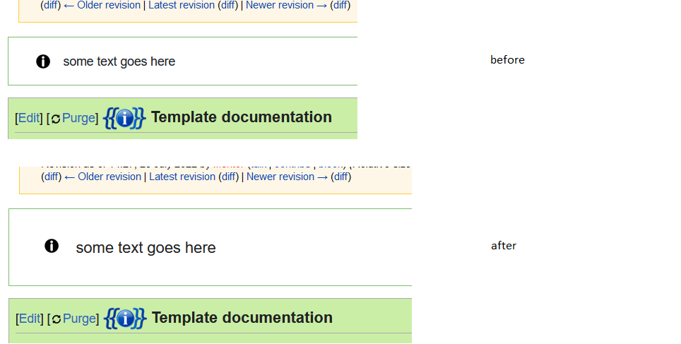
- --Tigerfell (Let's talk) 10:56, 29 July 2022 (UTC)

List of articles which use Wfmessage template
Is there any way to get a list of articles which are using currently the {{Wfmessage}}?--MalgiK (talk) 20:29, 9 October 2022 (UTC)
- Try https://wiki.openstreetmap.org/w/index.php?title=Special:WhatLinksHere/Template:Wfmessage&hidelinks=1&hideredirs=1. Andrew (talk) 21:15, 9 October 2022 (UTC)