Tiles@home/Dev/Appearance
Subterran waterways
See: http://lists.openstreetmap.org/pipermail/talk/2007-July/016130.html Could someone please implement this? Or is would it be better to submit modified oms-render-rulefiles somewhere?
--Jannis 13:29, 22 August 2007 (BST)
Different rendering rules for zoom levels
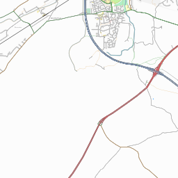
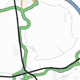
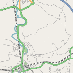
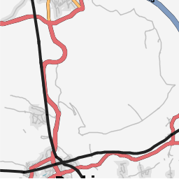
e.g. at zoom 12
|
Ojw prefers this style, since you can see more detail |
|
|
|
Mapnik style, for comparison |
|
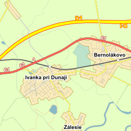
Another variation. Uses red for primary and green for trunk. |
|
Yet another variation from Slovakia@OSM |
Road names at higher zoom levels
Coastlines
Are coastlines not visible at zoom-12 currently? Ojw 13:21, 28 February 2007 (UTC)
Schools
Would it be possible for schools to show up, both nodes and areas? They are often located in areas that are otherwise densely populated with streets. -Thewinch 01:31, 8 May 2007 (BST)
- Its not only schools, threre are many icons missing on the t@h layers. "military" areas are also not rendered. I could add things but i dont know which colour to choose.--Damian 08:18, 8 May 2007 (BST)
Naming
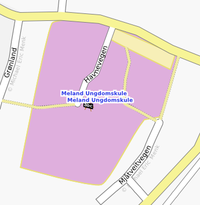
Name on Schools should not bee both on arias and node. In my opinion the name should only be rendered on the node. That way you can control that the name is near the main entrance. And having schools as both arias and a node, is smart if you are need to shrink the size of the xml file by deleting arias, to get it on a portable device. --Mikemenk 22:31, 9 September 2007 (BST)
Area=yes
area=yes needs to be implemented. In my opinion is the most important tags highway=pedestrian, and highway=service. highway=pedestrian for plaza and marked squares, and highway=service for aria where you wait in line for a ferry.--Mikemenk 22:37, 9 September 2007 (BST)
Antialiased tiles
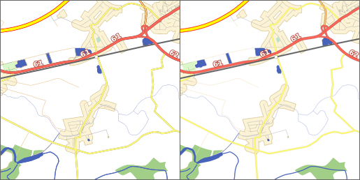
On www.freemap.sk we are using slightly modified tiles@home client with support of tile antialiasing. SVG rasterizer (Inkscape) produces 2 to 4 times bigger png file, which is resampled by mogrify (part of ImageMagick) to desired size.
Ok, inkscape has its own antialiasing, but see the difference: left image has only inkscape antialiasing, right image is resampled.
untagged ways as faint grey lines
In my opinion, we should show untagged ways as faint grey lines on the tiles@home layer (and also Mapnik actually) An 'Untagged way' is a way with no tags, or with just a 'created_by' tag. So no highway=x.
This idea relates to sketching over Yahoo Aerial Imagery. I wrote a lot on the topic over at Talk:Yahoo! Aerial Imagery#Sketching - Is just tracing useful?. The conclusion being that we should make this rendering change, and then discourage the use of highway tags when sketching (Actually this is already discouraged on the Yahoo page, but perhaps not prominently enough) The result would, I think, be a good comprimise between showing people's sketching work on the map, and paying respect to people who have put hard work into surveying ("proper mapping") -- Harry Wood 16:23, 12 December 2007 (UTC)
- I support that request. (The common case where I know the status of a road so that I can give the highway tag but don't know the name can be handled by the maplint layer.) --Colin Marquardt 12:50, 7 February 2008 (UTC)
apron/taxiway rendering
aeroway=apron and aeroway=taxiway should be rendered more alike. Taxiways have thick black borders while aprons have none at all: [1]. Suggestion: both with same background and back border. Taxiways on top of aprons should have no borders (Planes can leave the taxiway anywhere here). To see the taxiways on aprons, however, they should have a thin white line in the middle. --Coomba 19:51, 18 June 2008 (UTC)
tracktype rendering
The tracktypes are currently coded in the border of the ways. This is visible on land hardly distinguishable in forests: [2]. Maybe base color or thickness is a better way to show the tracktype? --Coomba 19:51, 18 June 2008 (UTC)
national park and protected area rendering
Rendering of National Park Boundaries in osmarender is great: distinctive green dashed lines.
Could we please have something similar for Protected Area Boundaries: perhaps yellow or tan dashed lines?
I suggest that closed ways in these two categories be automatically filled. The ideal fill might be a green mesh for National Parks and a yellow mesh for other Protected Areas. A bit like the current ‘transparent mesh effect’ used for the leisure:nature reserve tag; but preferably with a different mesh pattern.
Explanation:
1. Boundaries. National Parks and Protected Areas are very important information for map users, for their combination of ‘responsible recreation’ and conservation uses (and penalties for incorrect use even through ignorance of their existance). Typically these designations by governments indicate different levels of rules for users. For example, in my area of Australia a marine National Park means no fishing whereas a marine Conzervation Park means that certain types of non-commercial fishing are allowed. Maps are very important indicators that these zones are likely to have different types of restrictions (then users can check local rules).
2. Fill: These are often big areas over other details important to map users, but hard to follow from the boundary alone, so a ‘transparent mesh’ fill works very well. At present, some people are tagging both types of zones with ‘lesiure:nature reserve’ (possibly to get them rendered on default maps). It seems better to fill these two zone types automatically and allow the leisure tag to be used for all kinds of other purposes like private nature reserves.